

Q Link Wireless offers free wireless services, including calls, texts, and data, to eligible low-income Americans through the Lifeline Assistance program. This government initiative ensures essential telecommunication access for low-income families.
In a tight spot
While most love the accessible business model, destination page is not translating into sales, a high % users drop off after 1 or 2 clicks and average 104 seconds on the page. Why?
Cracking the code
Delving into content analysis and research, we aim to improve potential clients understanding of what's unique about the service in a highly competitive market.

What % of users that open the page converted?
Between 1 - 2.5%

DESIGN PROCESS
Establishing a roadmap
Having first confirmed accurate customer behavior analytics, we planned to start conducting interviews with selected users on their experience. Then, we planned on embarking on a thorough content audit, focused primarily on the mobile experience by breaking down the content among all the relevant sections. Finally, we'd perform usability research on transitional points.
Skills used
✅ Customer behavior analytics
✅ User interviews
✅ Content audit
✅ Usability research
✅ UI Redesign
✅ A/B Testing
✅ Customer behavior analytics
✅ User interviews
✅ Content audit
✅ Usability research
✅ UI Redesign
✅ A/B Testing
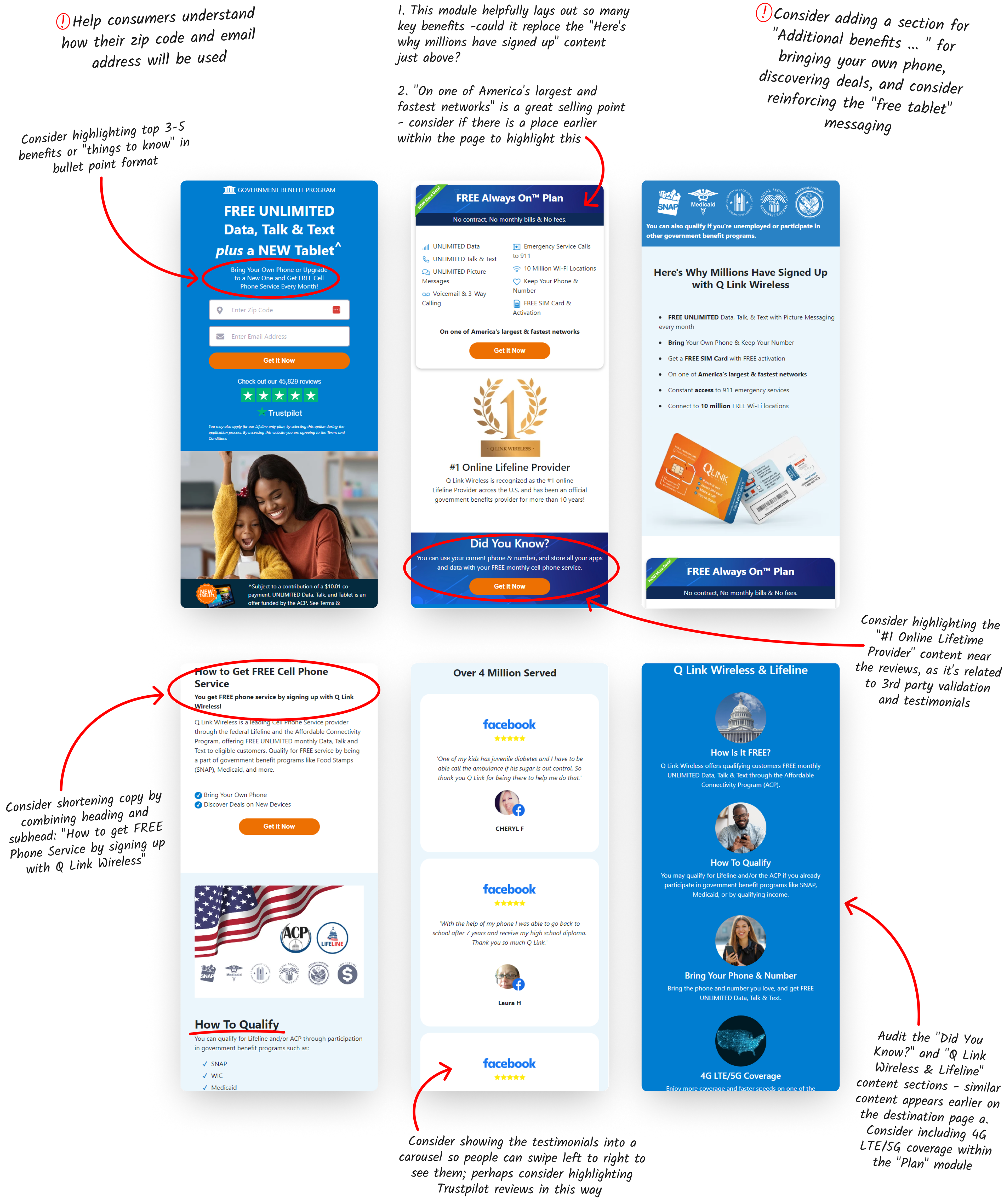
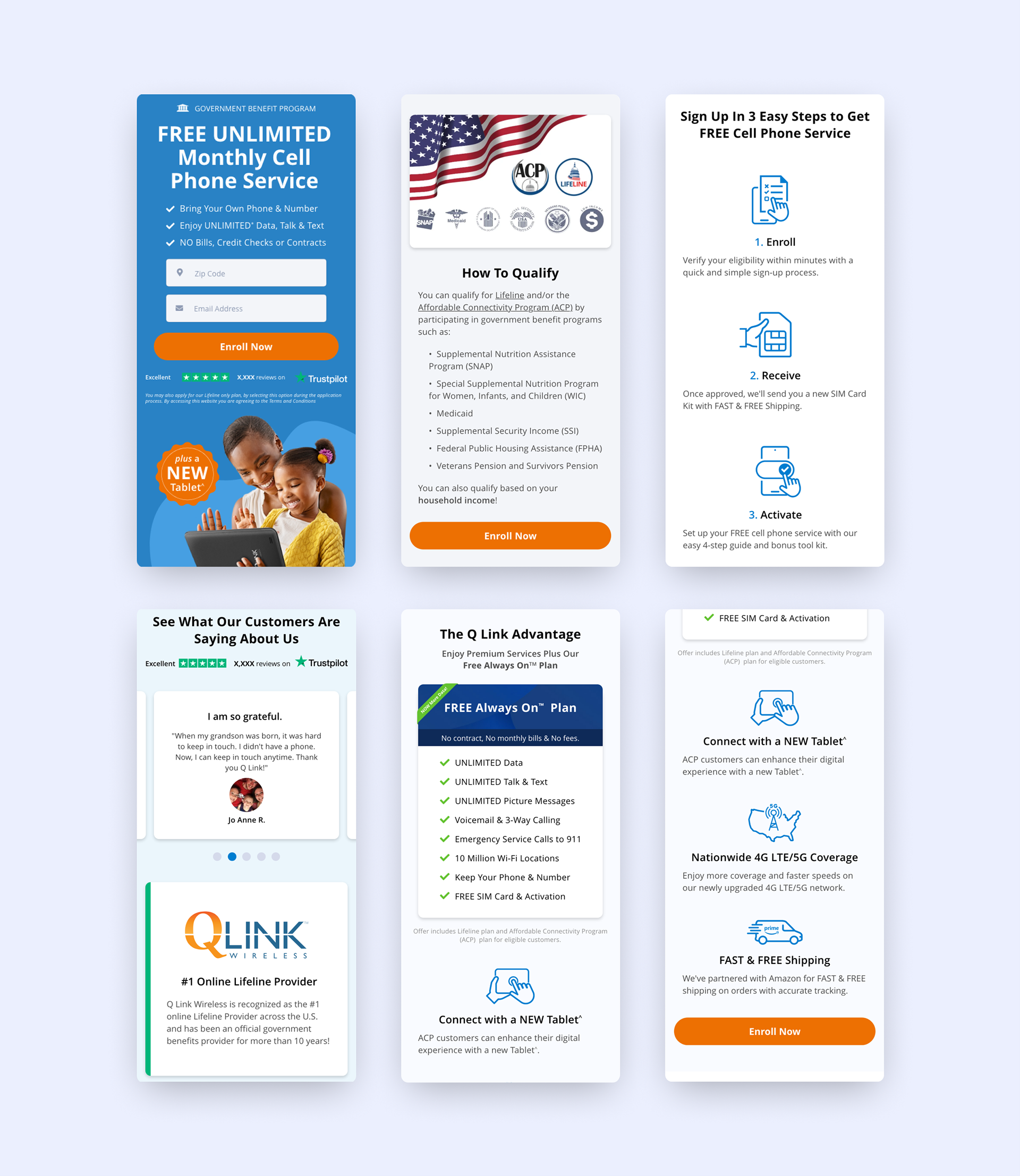
Original destination page layout
First things first: Interviews
We did 4 interviews in total, I personally conducted 2 contextual inquires to better understand how people felt about their experience using the page. I was keenly interested in if people understood the depth of the service provided and how quickly they gathered the information they would need in order sign up.
I learned the following:
• Information is repetitive and reworded across the page, requirements for application are unclear.
• Felt overwhelmed by the page's length.
• Loved the additional benefits once they discern them among the offer and value propositions.
• Excited about the service once they learned the scope.
Content audit
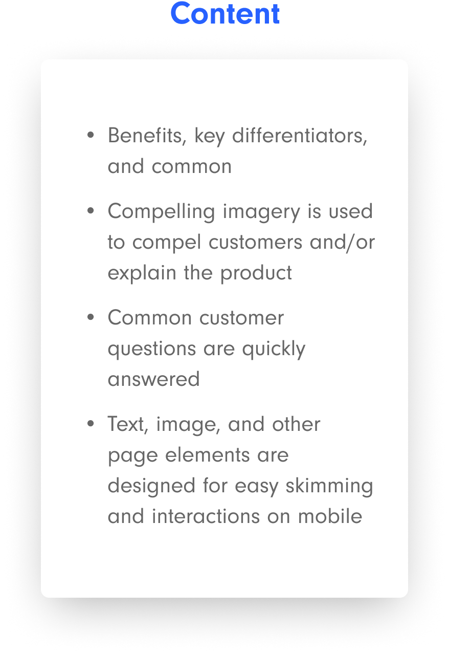
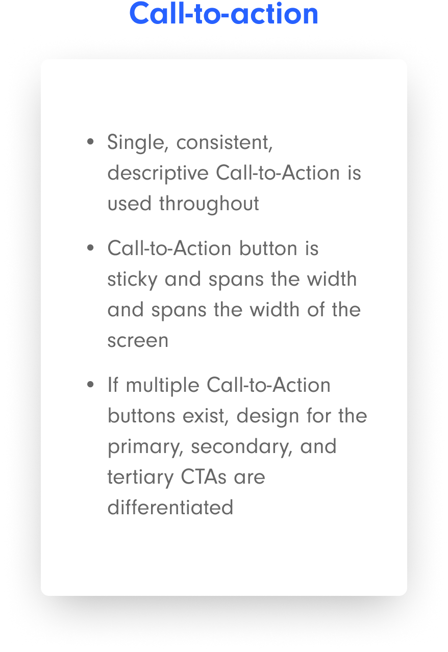
We determined our audit should be based on the 3 Cs optimization guideline below.


$427B
in sales lost in 2020 due to suboptimal experiences.
Mobile checkout optimization: 10 ways to retain mobile shoppers in the checkout process”, Baymard Institute + Amazon Pay, Us + EU (2020)

Usability research: Analyzing the nitty...
1. Ensure that form fields surface the correct keyboard - in this case, zip code.
2. Implement autofill as soon as someone taps into one of the fields, not after they begin typing.
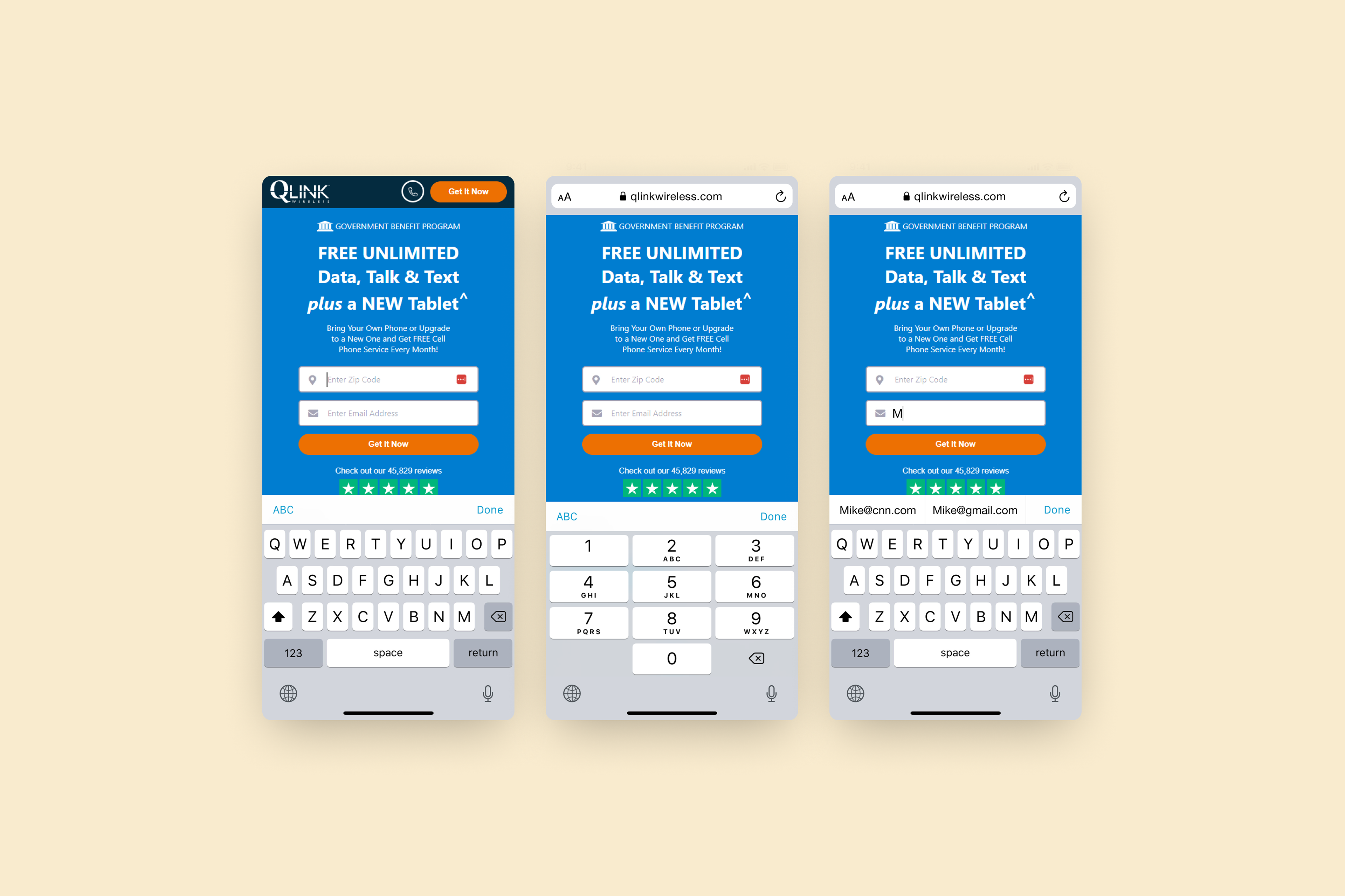
...and the gritty
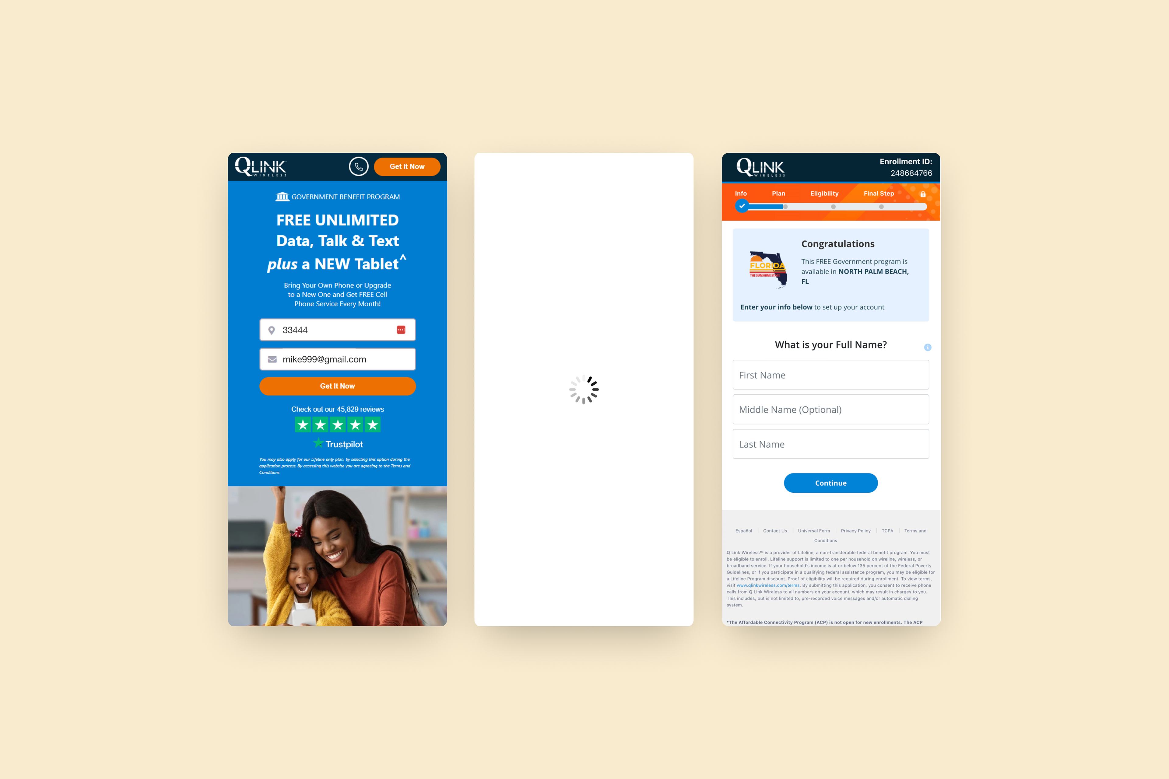
1. Note that there is a lengthy loading time once people initially submit their information
2. Once consumers arrive on the more detailed qualification page (case study #2), consumers cannot swipe back to the previous destination page.
Putting it into perspective: Design
Based on our content audit and research, we continued on by wire framing the different sections, focusing on summarizing information points, enhancing our value proposition, and condensing copy. We focused on information architecture, hierarchy, and UX writing.
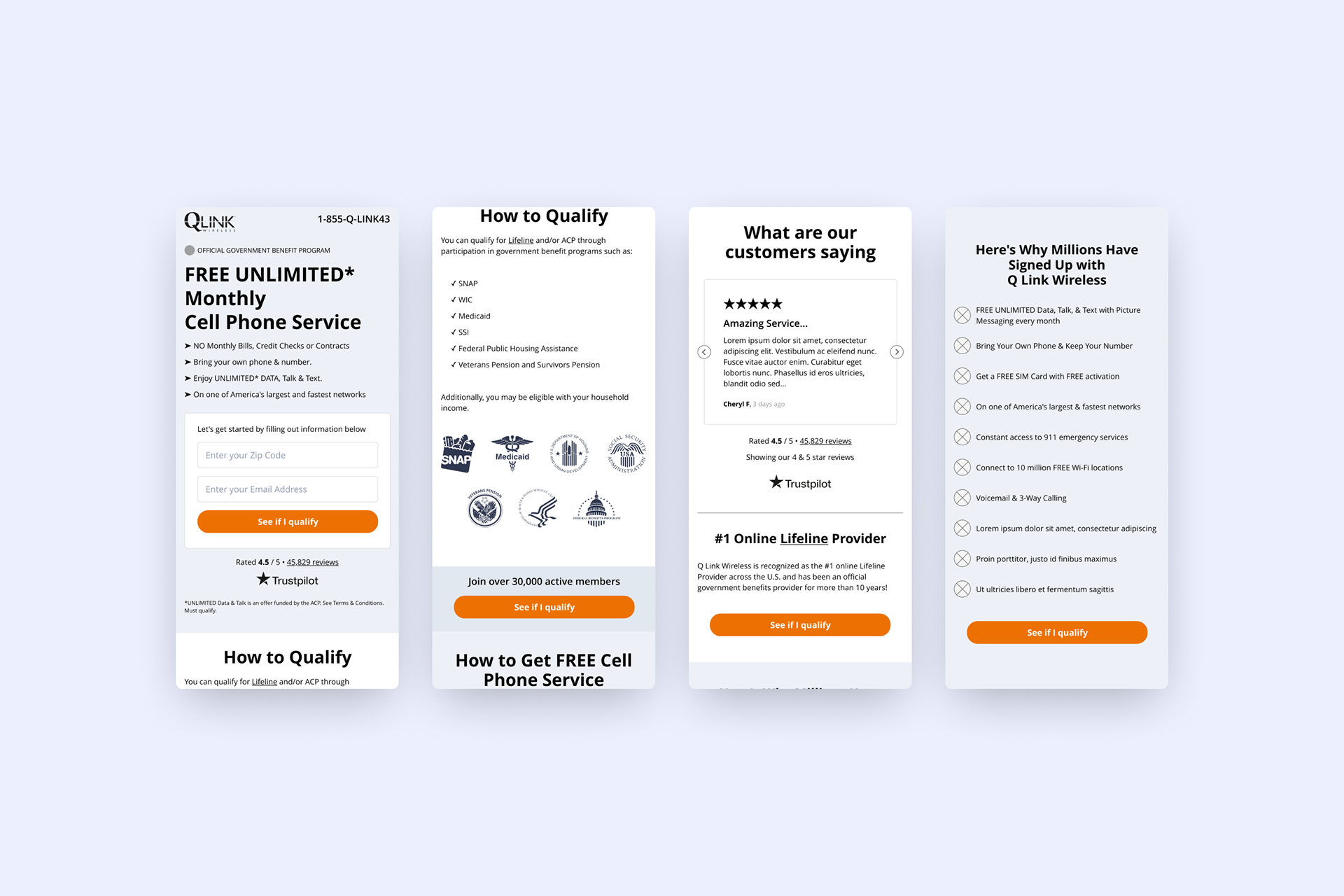
We also created different iterations of the fold area section, enhancing the value proposition communication, playing with color contrast options and visual message delivery (product or emotion).
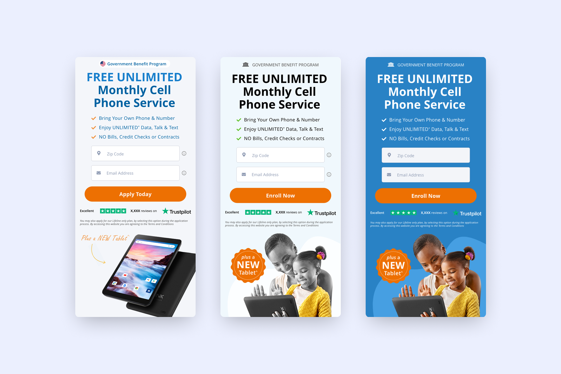
UI Redesign
We created a fully-functional, high-fidelity prototype of the destination page.
Wrapping it up: Usability testing
Based on the selected high-fidelity prototype, we recruited subjects for the test, who matched potential users of Q Link. We did 3 usability tests while the users felt they could trust the services and liked the information they received from the new design the issues that we’ve identified:
Issues
• Button copy was still inconsistent.
• Disliked the lengthy qualification process (case study #2).
• Curious about membership details and maintenance.
• Different opinions on different color contrast fold options and the company's identity colors.
Solutions
We summarized most of the information that still came across as inconsistent and redundant. Fortunately, it was easy to go back and keep on editing.
And even though option 2 (above) offered better color contrast, stakeholders felt it would be better to use the option that reflected the previous color scheme and the company's identity colors.
Final destination page proposal

66%
is the average destination page effectiveness score.
Meta Branding Brand Analysis, 2022

Next steps: A/B testing guidelines
I would love to continue working on this project to help see Q Link grow. The next phase would include A/B testing with the previous version:
Hypothesis:
Better destination (landing) page experience will:
• Improve conversion
• Decrease Cost Per Results
• Increase Return on Ad Spend
• Decrease Customer Drop Off Rate
• Decrease Cost Per Acquisition
• Decrease Cost Per Results
• Increase Return on Ad Spend
• Decrease Customer Drop Off Rate
• Decrease Cost Per Acquisition
Test structure:
• Split test
• Conversion lift
• Conversion lift
Test parameters:
• ~2-4 weeks
• Audience: Prospecting > Broad targeting
• Primary KPI: Conversions
• Secondary KPI(s): Clicks, LDPV, Customer drop-off rate
• Optimization : Conversion/Purchase
• Autobid
• Audience: Prospecting > Broad targeting
• Primary KPI: Conversions
• Secondary KPI(s): Clicks, LDPV, Customer drop-off rate
• Optimization : Conversion/Purchase
• Autobid

Conclusion: My takeaways
This project taught me so much I had the ability to expand my understanding of:
• UX writing
• Information Architecture & Hierarchy
• Search Engine Optimization
• Data Analytics