


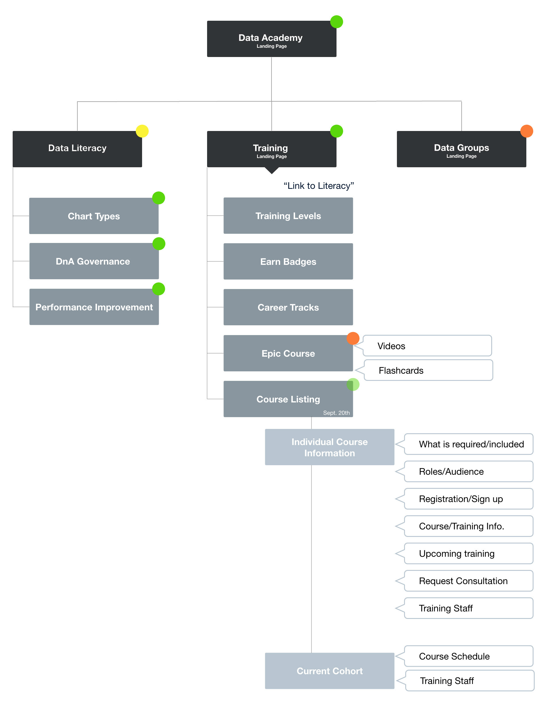
NYCHHC is the parent company for many hospitals and clinics in the New York metropolitan area. As a governmental service provider, they manage a number of different entities, which in return provide with an enormous amount of data through the Data and Analytics department. DnA focus is to collect, manage and funnel these sets of data, and provide its employees with the appropriate tools to access this information.
Problem
Without an effective training portal, the company faced challenges such as data inconsistency, inefficiency in training processes, and difficulties in tracking and analyzing training outcomes.
Solution
To address these issues and ensure streamlined training operations, a purpose-built training platform becomes an essential solution for all NYCHHC employees.
RESEARCH
Learning more about our user
In the initial stage of the project, DnA supplied the project idea, priorities, color palette, styleguide, video training materials, and pre-defined user personas. The objective of this phase was to generate user stories, user flows, wireframes, and HiFis. The goal was to create a successful product that could showcased to stakeholders and users, providing a tangible representation of the final product's look and feel.
Using Zoom, the remote team members (DnA Director, product manager, 3 engineers, and myself, the UX/UI Designer) held an introductory meeting to discuss our initial thoughts on the project, based on the assets provided and the briefing given by the project manager. Without delay, the team delved into discussing user stories based on pre-defined personas, which was the first deliverable that needed to be completed.
The product manager instructed the team to note down any follow up questions they had as we started the research process.
Skills used
✅ Interviews
✅ User flows
✅ Wireframes
✅ UI iterations
✅ User flows
✅ Wireframes
✅ UI iterations
✅ High-fidelity prototypes
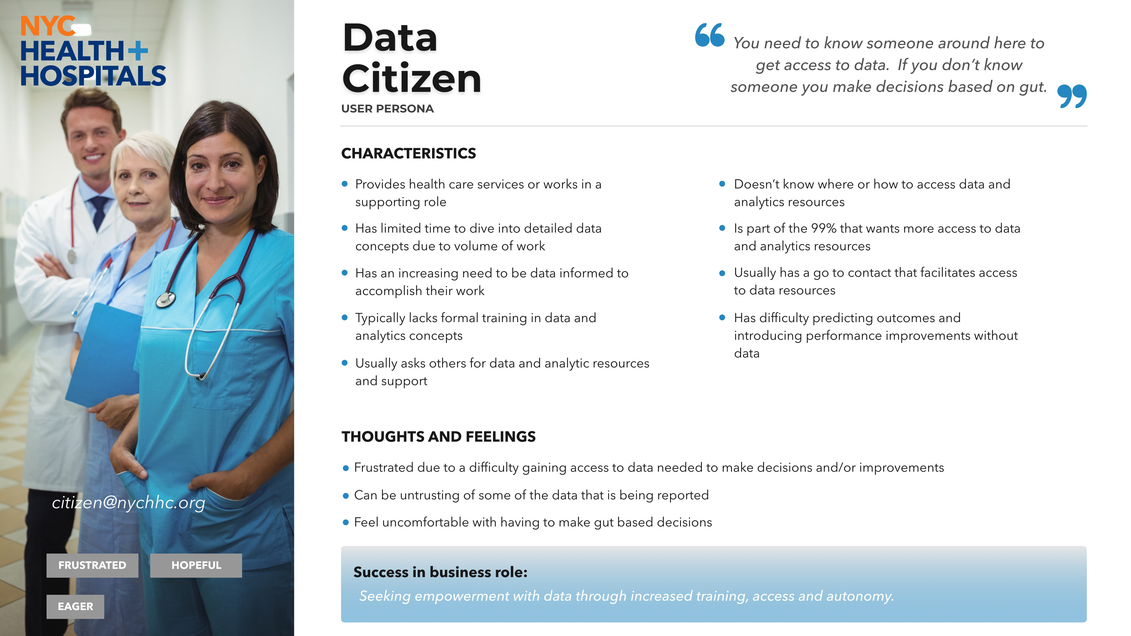
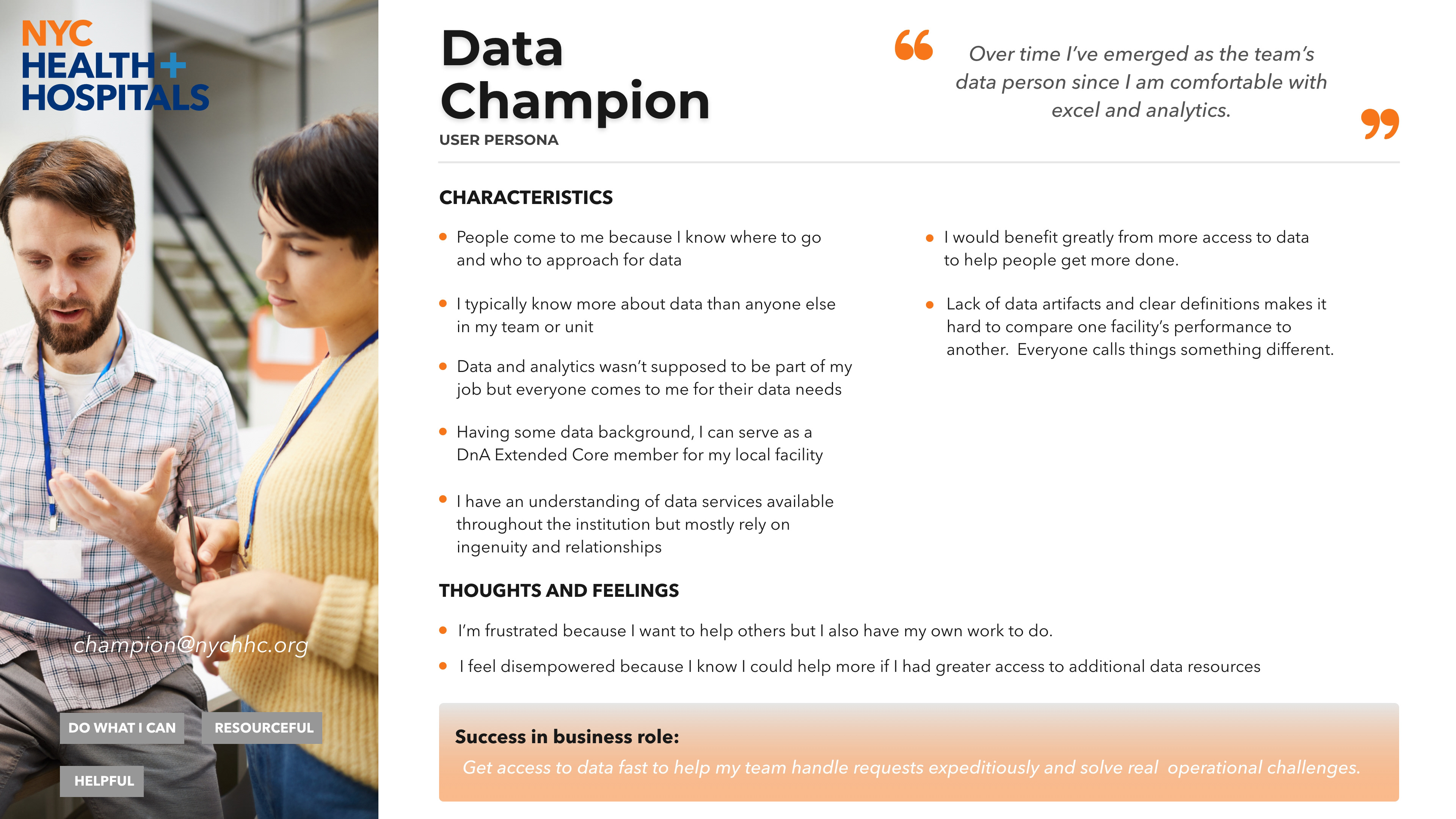
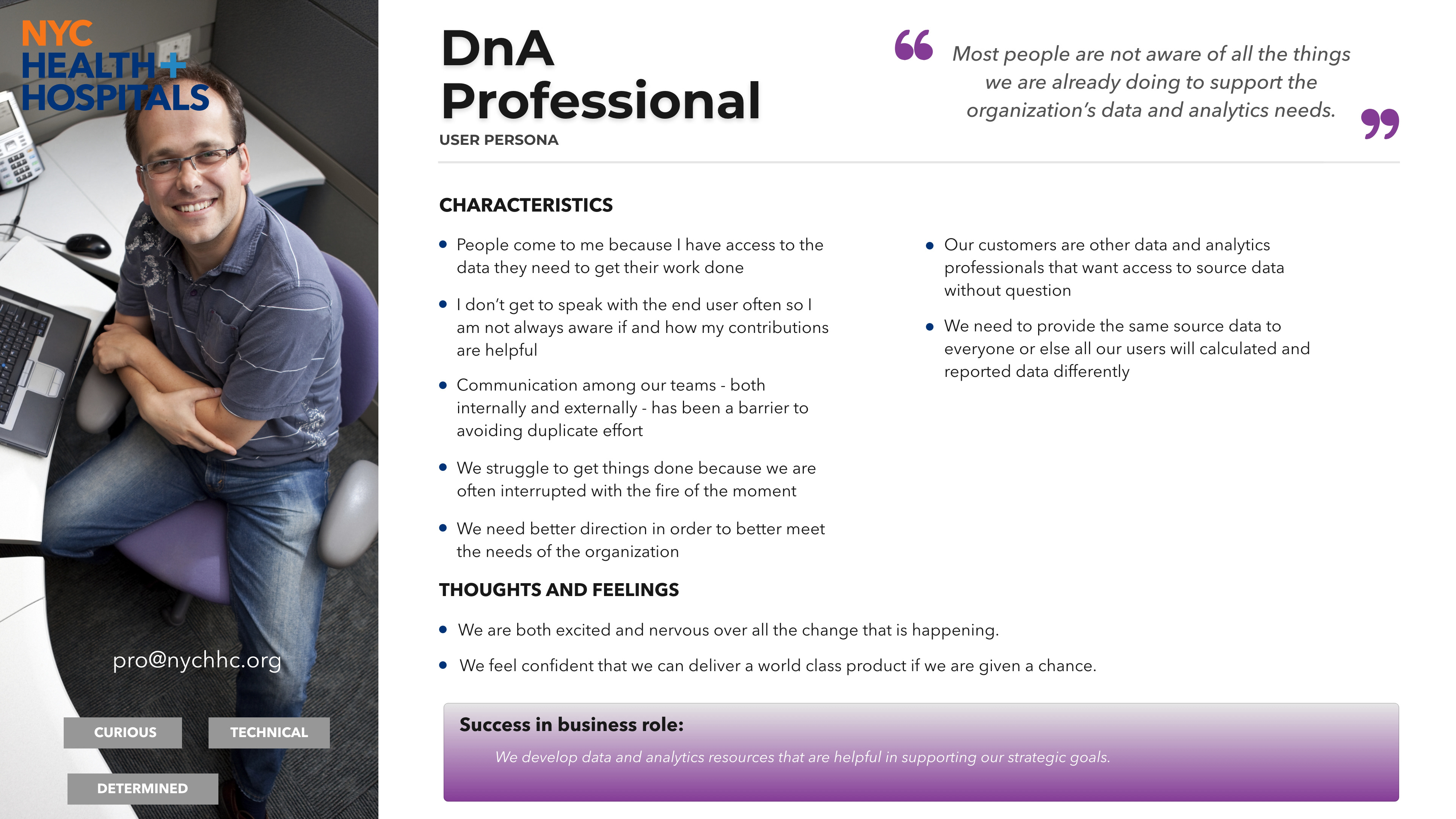
Pre-defined user personas
Color palette

Answering doubts
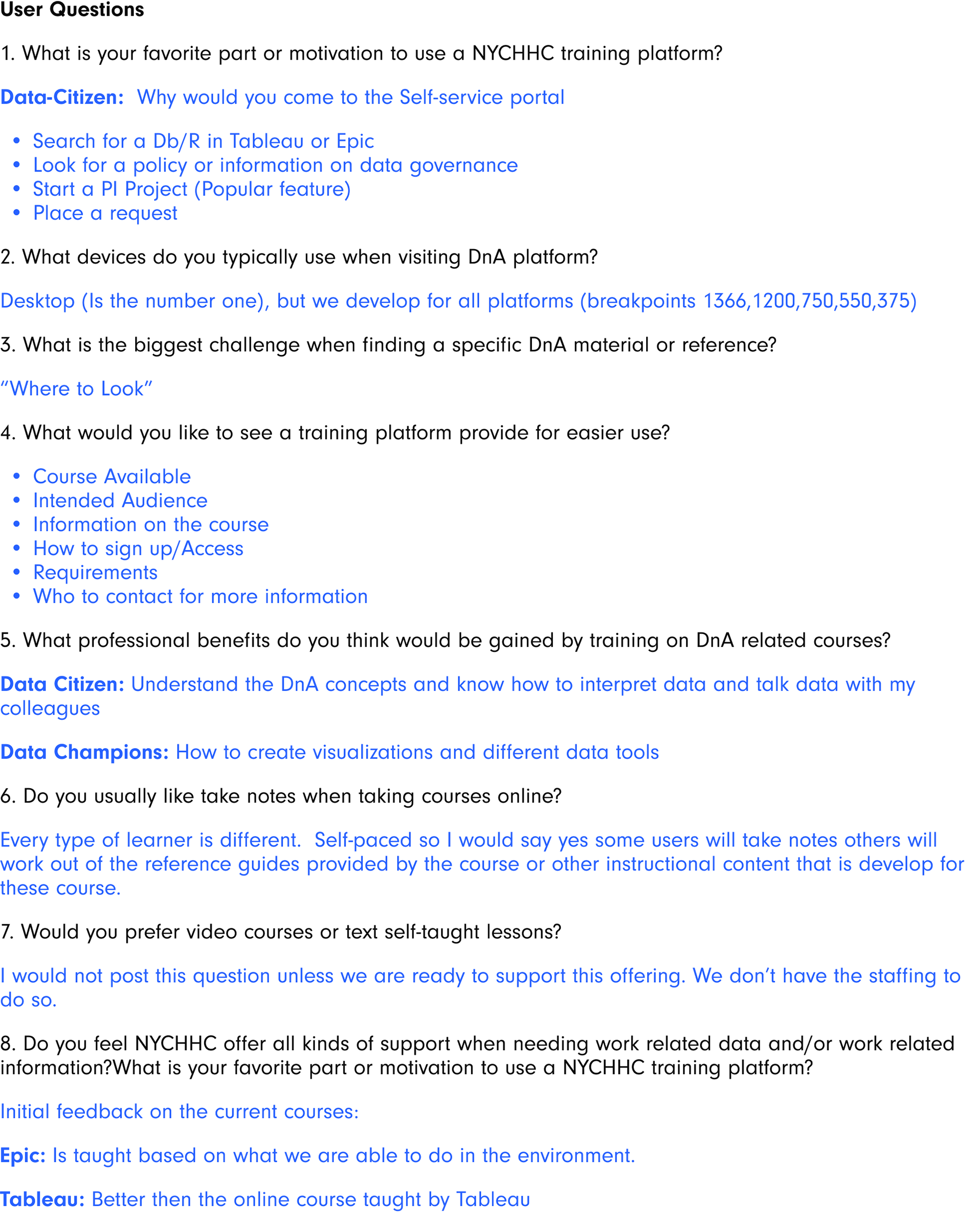
Given the highly technical nature of the product, it was imperative to establish a comprehensive overview. As we were working on the first phase, I had several questions after reviewing the brief and meeting with the team. While the brief provided a surface-level explanation, it lacked specific details such as how the courses were going to be arranged. Additionally, it was crucial to identify potential different paths and ensure that the portal was user-friendly for all, increasing the likelihood of engagement by most users. Some of the key takeaways:
• Access was only for NYCHHC employees through the company's intranet portal, pre-logged in.
• Users want different learning options - self-paced or guided.
• Information about tutors, or more experienced peers with relevant training know-how.
IDEATION
User stories
For DnA, the user stories that were deemed most crucial revolved around the fundamental options of the portal. These user stories were essential in demonstrating the scope of the idea and securing full stakeholder support. These were defined and provided by the project manager with the help of the aforementioned interview process.
• As a user, I want to find available courses on relevant information.
• As a user, I want to take any relevant course at my discretion, track my progress, and test my knowledge.
• As a user, I want to be guided from 0, and/or follow a specific career path.
User flows
Using the established user stories, the team created the following 3 user flows, working individually, then in group work sessions to present and iterate on the flows. These user flows were determined to be vital to the portal because the different types of users that would use these paths most frequently.
I worked in collaboration with product manager on user flow for setting up the proper paths and actions to follow accordingly. Through work sessions we developed several iterations, eventually honing the experience with stakeholder feedback so the user can easily accomplish the tasks but also accounting for alternate routes in and out of the process.
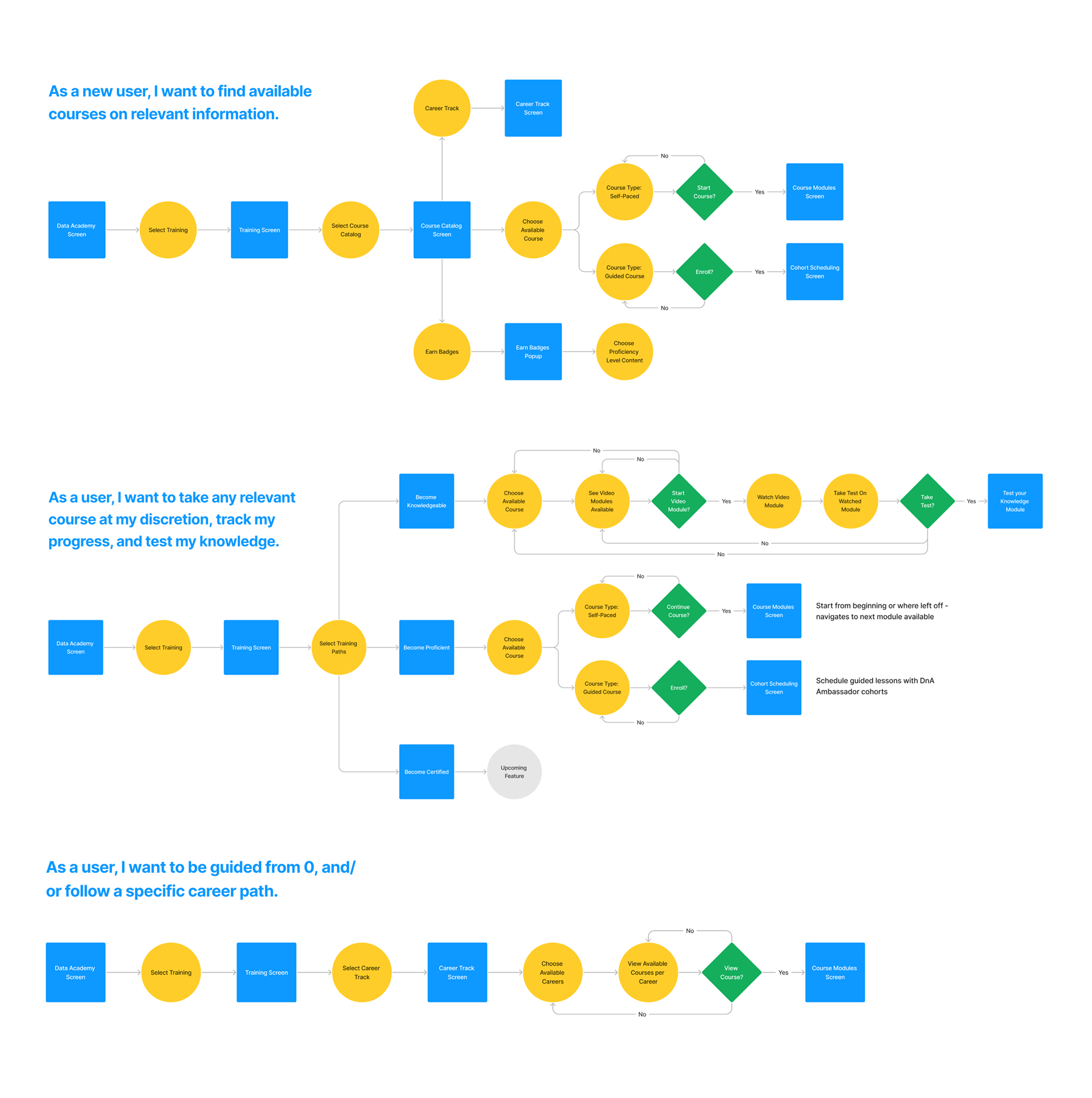
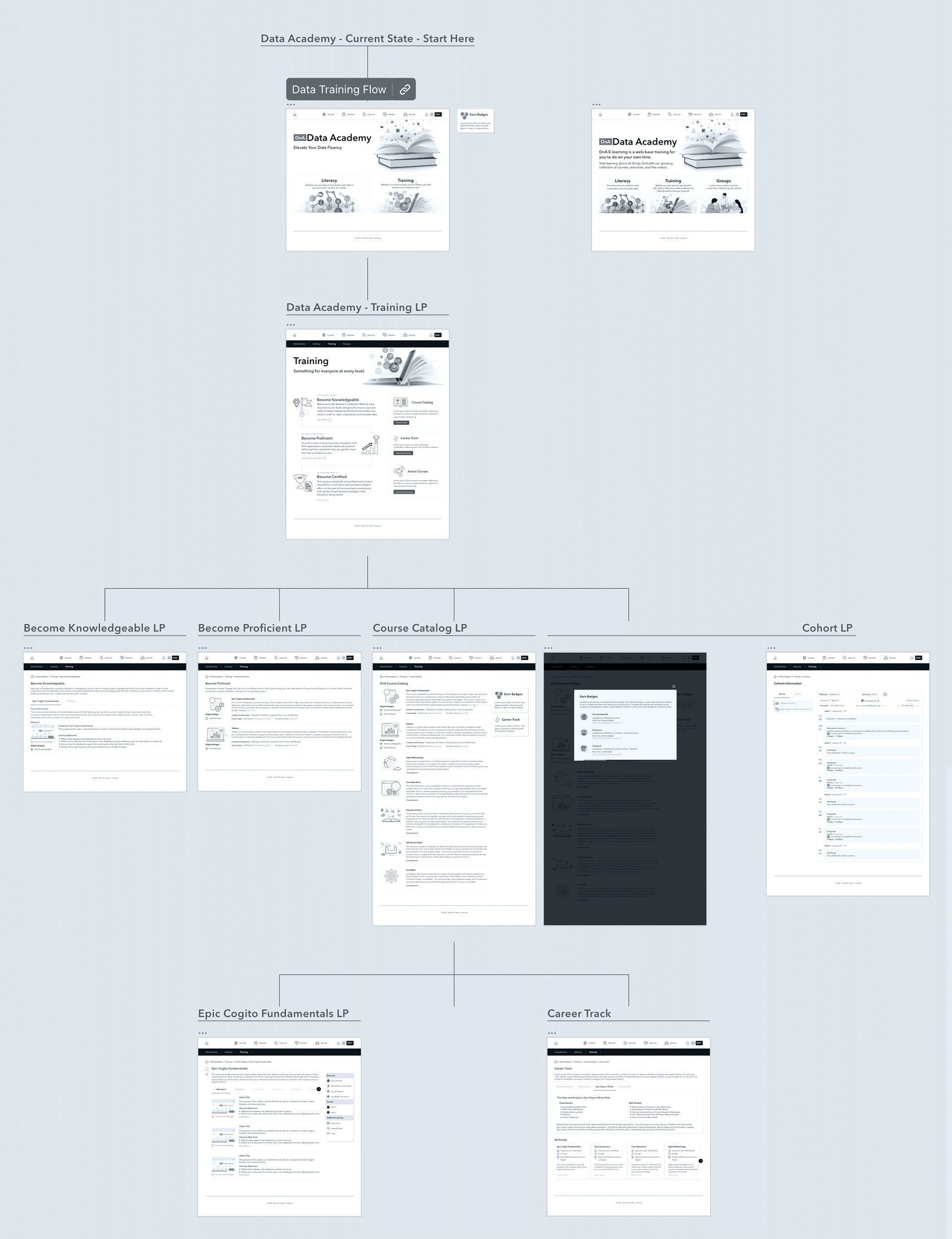
Page flow
With a set of user flows, I was able to start laying out a preliminary page flow and sitemap, ensuring that the structure was intuitive and user-friendly. This process involved mapping out the main pathways that users would take through the site, identifying key interactions, and organizing the content in a logical hierarchy.
By visualizing the user experience in this way, I could create a comprehensive blueprint that would guide the development of an effective and cohesive website."
DESIGN
Wireframes
During the initial phase of medium-fidelity wireframes, we explored numerous iterations for each user flow and presented them to the team during subsequent work sessions. I focused on designing the alternates paths and training landing page.
Collaborating with product manager, we discussed design patterns for the user flow, considering taking into account the various user types.

UI iterations
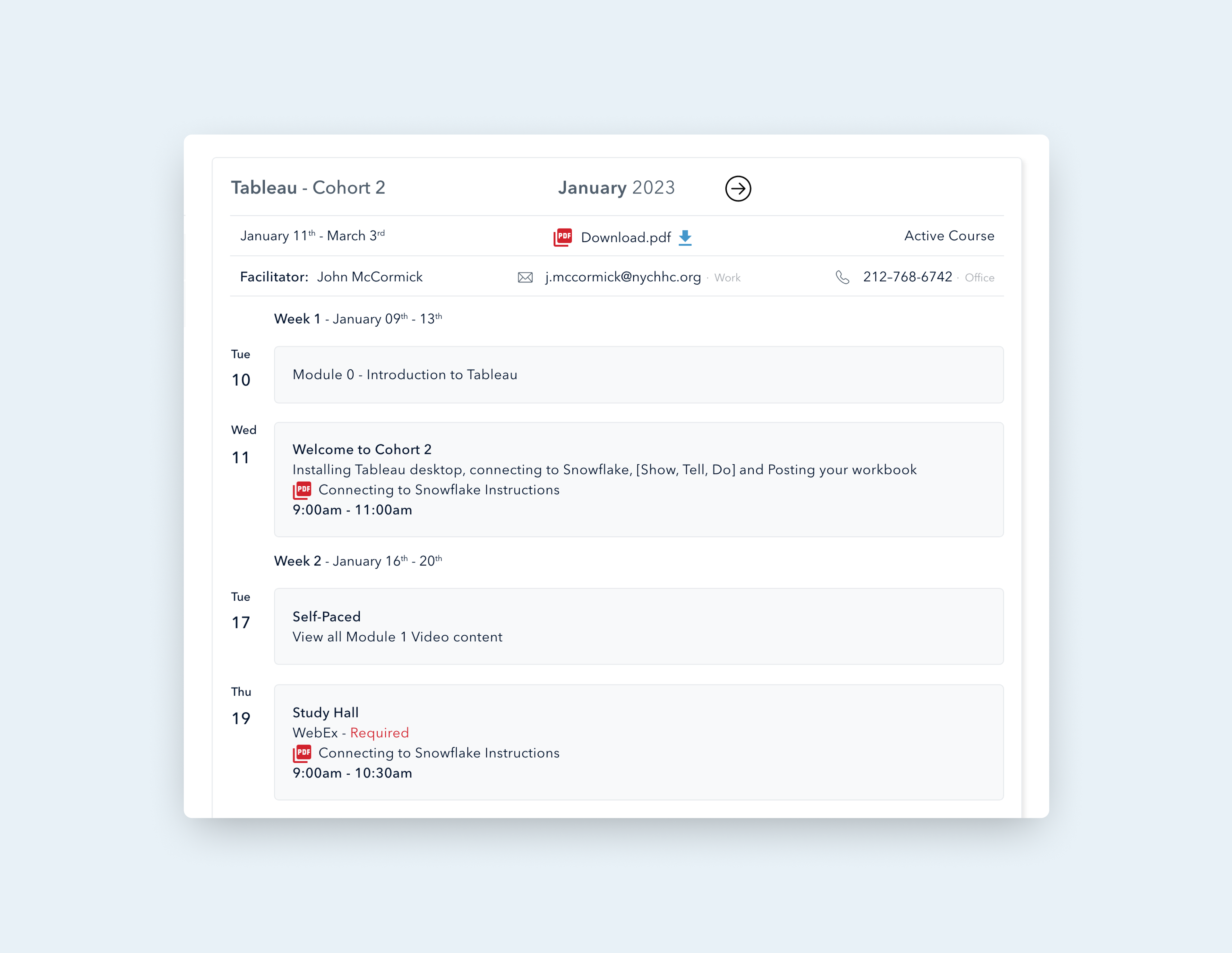
We used the stakeholder's feedback on the wireframes, provided color palette and style guide to begin implementing the UI iterations to create our initial HiFi screens. Additionally, we had to work with engineers and project manager to move the user flow of creating the cohort guided course screen into the next phase of design because it would require extensive design and planning.
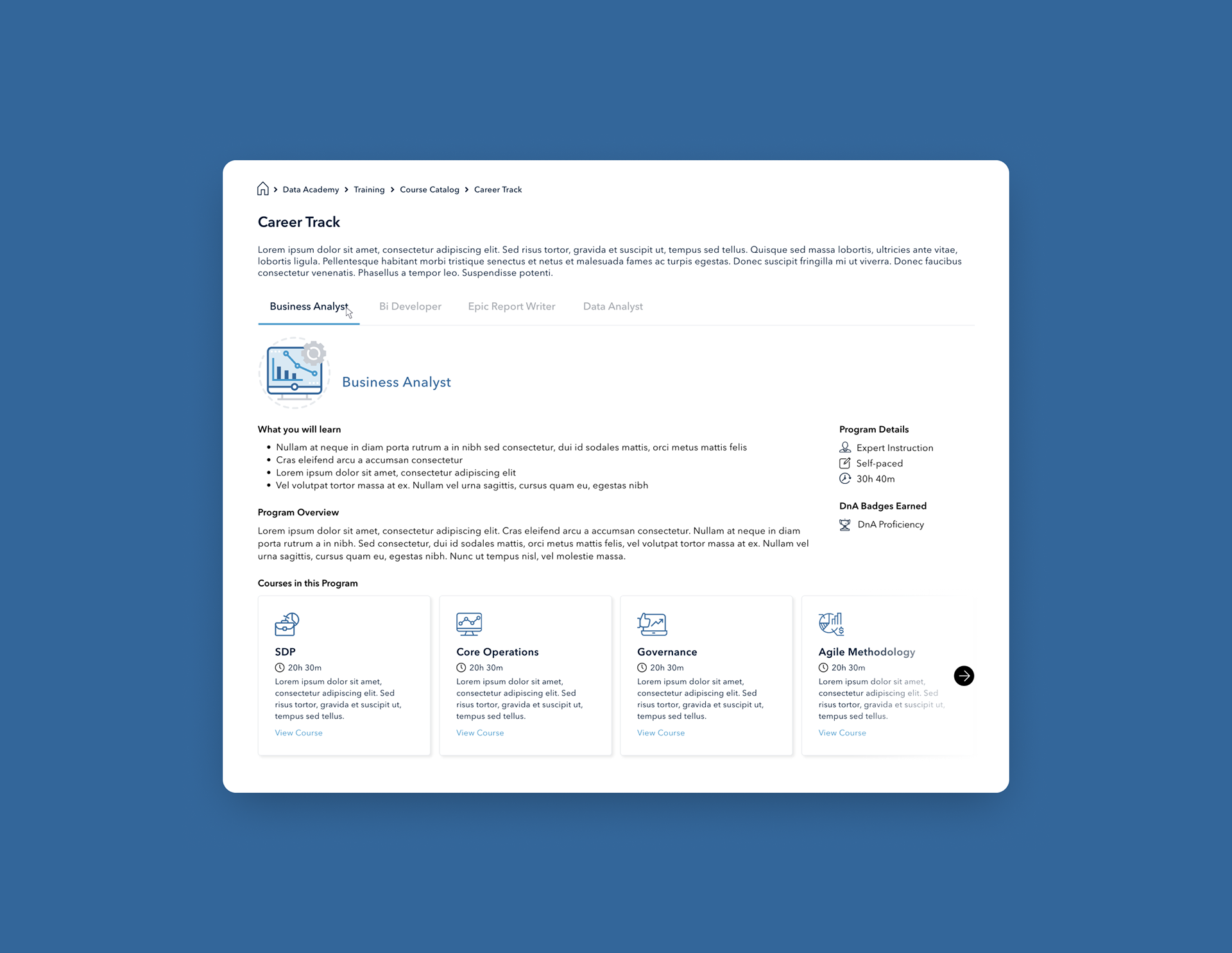
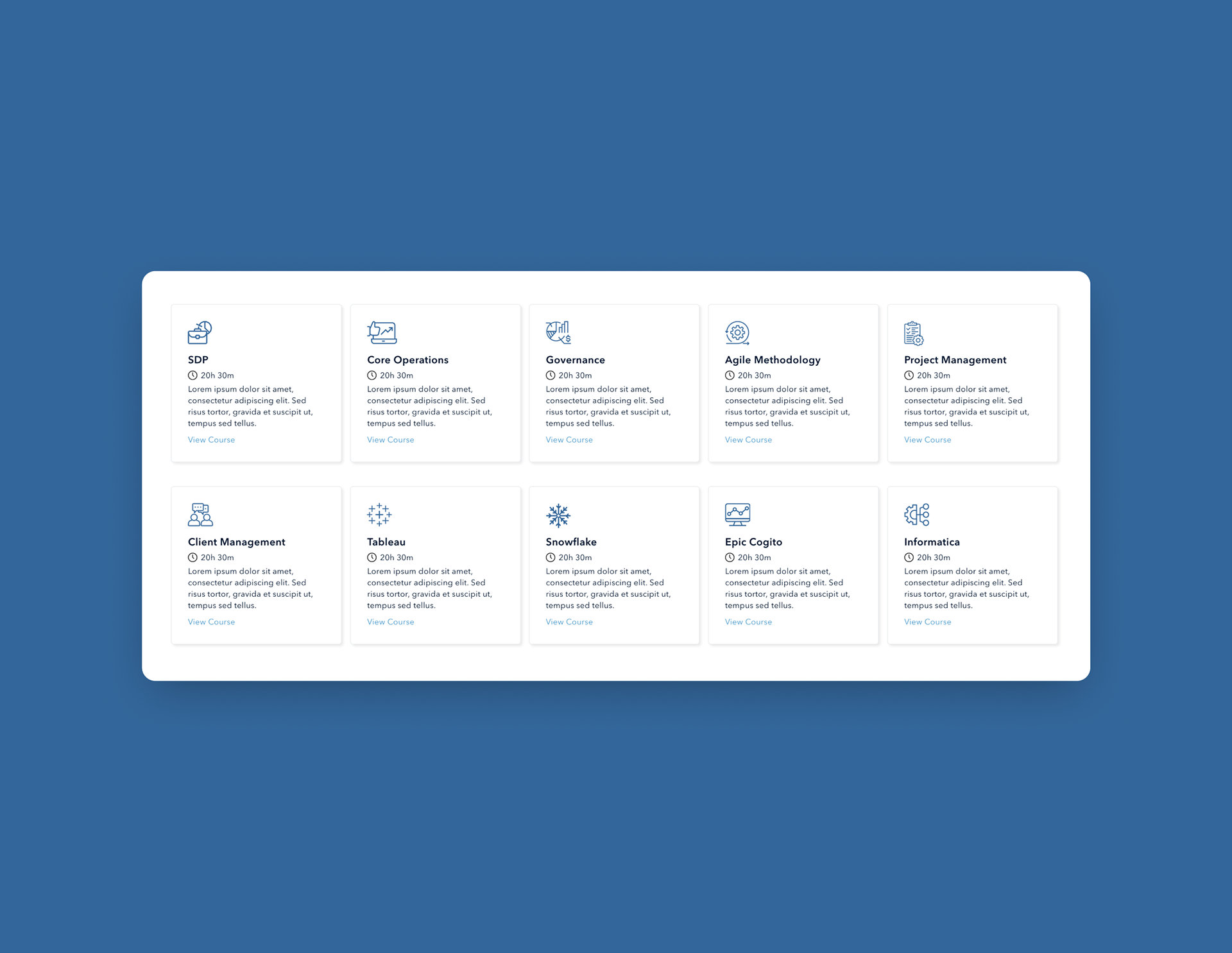
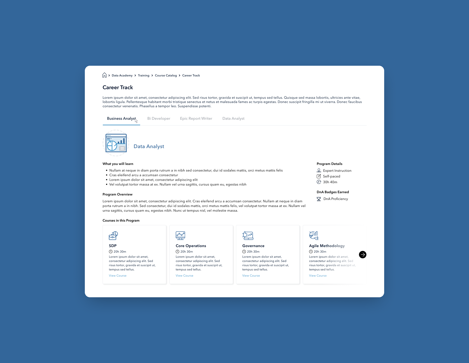
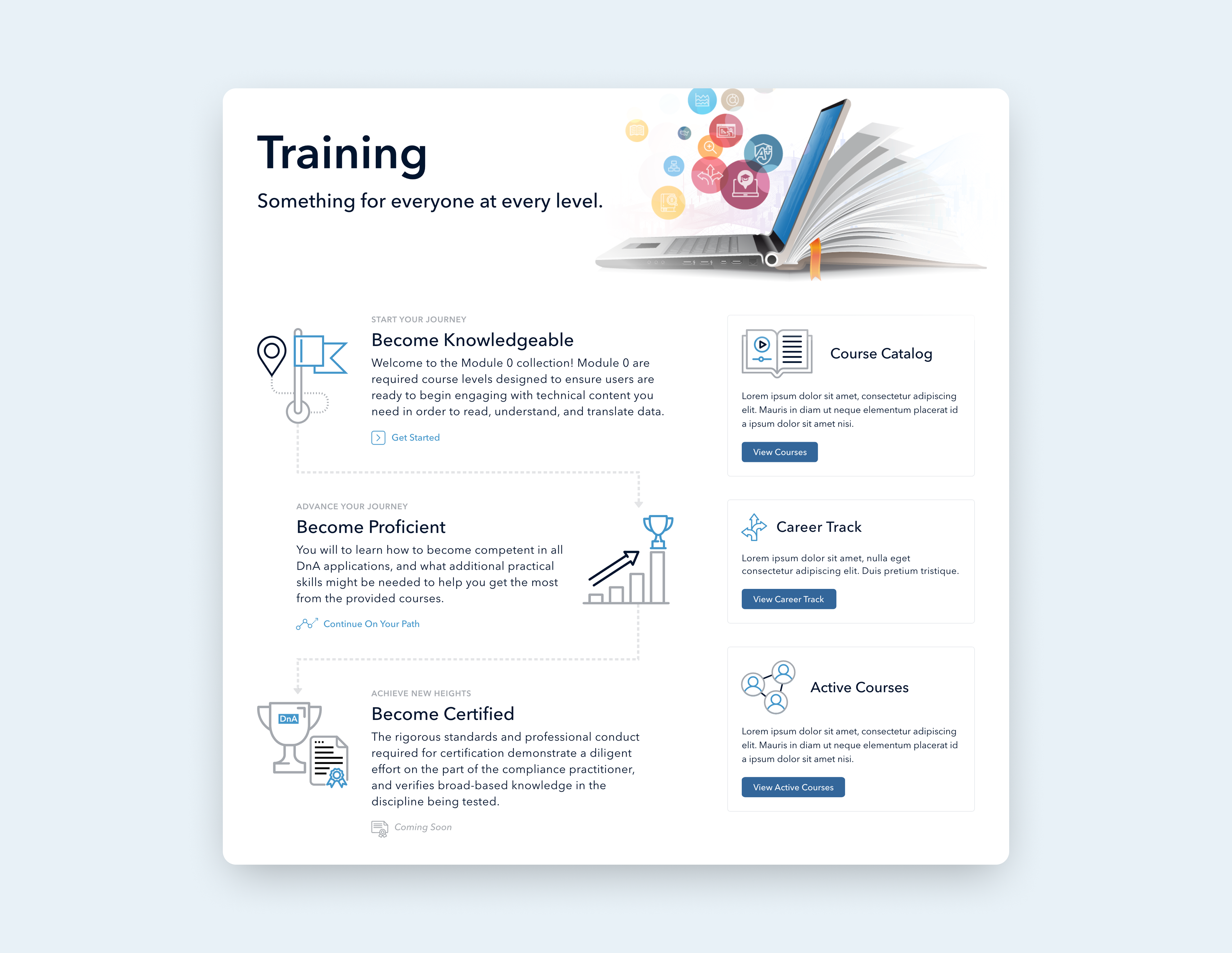
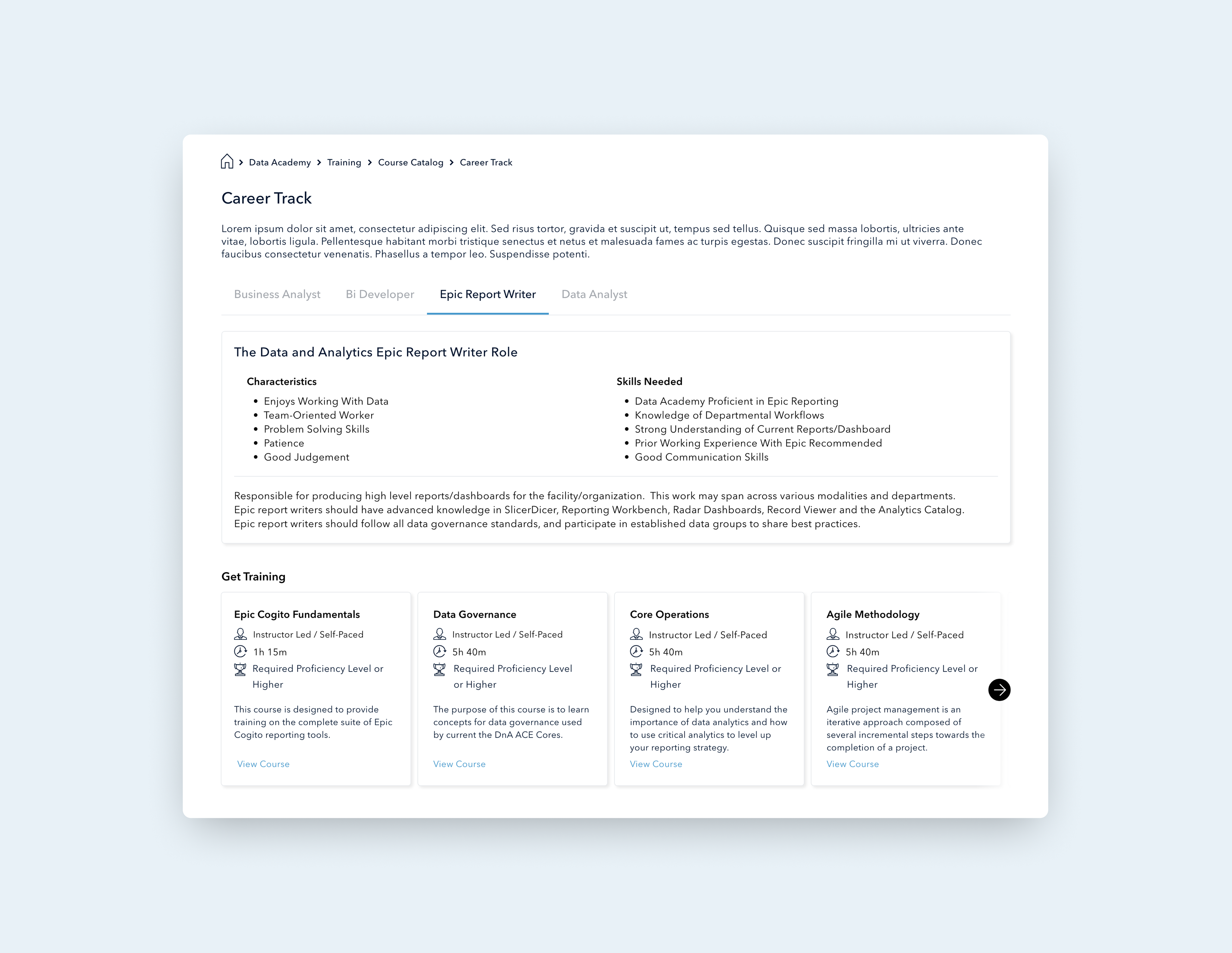
I worked on the training landing page, become knowledgeable path, becoming proficient path together with every module interaction, course guide screen, iconography, career track, guided course cohort, and each step of the user flow.
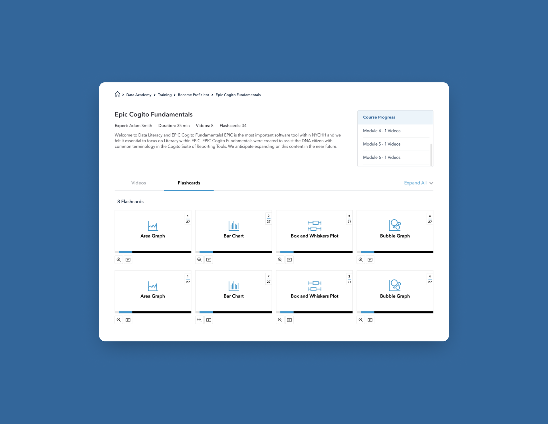
High Fidelity Screens
I contributed to group work on the high fidelity prototyping, helping to establish transitions and interactions. From these, I built a page user flow establishing a comprehensive flow.


Functional prototype
REFLECTION
Next steps
Our next steps involve conducting usability testing, and making changes based on user feedback. After feedback, I'd also like to continue to improve the usability of the dashboard to ensure all users will be able to utilize the tools effectively.
Results
The final site design presents specific training paths and information in an easy-to-digest format. Users can easily move through the steps in order to locate instructional videos and/or access the course catalog as they wish. Pages are only accessible for NYCHHC employees.